Wednesday, July 11, 2007

Different Styles by Lijo

Hi friends I am posting some designs of Lijo. How do you like them? Your constructive comments are welcomed.


Painting Photos

Have you tried painting photos on photoshop. Well you can give your photos an effect that looks like painting. Have a look at the following pictues. They are not perfect but practice can make them perfect.


Method
Apply brush strokes of your choice from the filter menu
Use Smudge tool
Again it is mere practice and what effect that you have in mind that matters. Photoshop is only a tool in your hand, what matters is real skill.

Type and Perspective

I am sure you are familiar with aligning text to path and then later adding perspective to them. You can have interesting perspective. Look at the following picture.

Method

Align text to the path
Add perspective
Use necessary filters as per your choice

Monday, June 18, 2007

Rembrandt Lighting


Have you heard of Rembrandt Lighting in photography? It is also used extensively in film.
Rembrandt lighting in photography is a lighting technique that is sometimes used in studio portraiture.

The key in Rembrandt lighting is creating the triangle or diamond shape of light underneath the eye usually furthest from the camera lens. One side of the face is lit well from the main light source while the other side of the face uses the interaction of shadows and light, also known as chiaroscuro, to create this geometric form on the face.

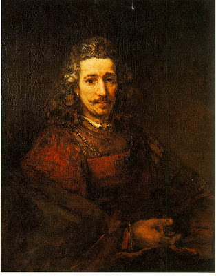
a painting by Rembrandt
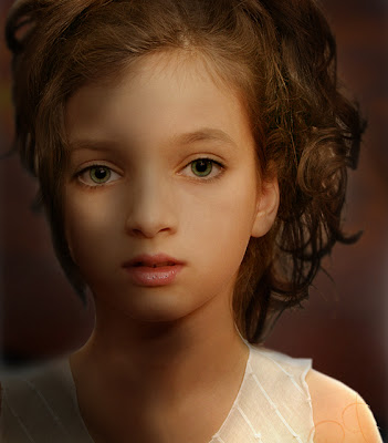
I have tried to give this lighting effect on photoshop. I know it is not perfect but still with practice we can surely do a lighting as close to the real Rembrandt Lighting

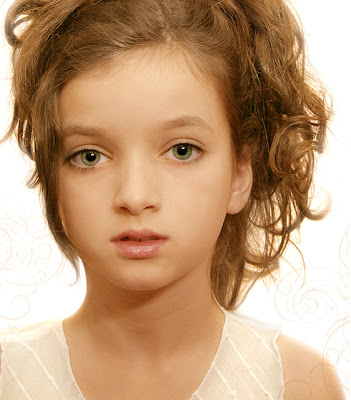
Original, the adjusted picture with Rembrandt lighting is given above


Rembrandt Lighting is aslo extensively used in film many shots of Troy has Rembrandt Lighting.

Next time you select a picture for your design, see about the lighting used in the picture. A flat lighting makes the picture unattractive. See from where the light comes and where the shadow falls. All the best..

Sunday, June 17, 2007

Blending Layers

I am sure you are familiar with blending the layers (using different blending modes). You can have wonderful effects using them. What exactly it does is at times confusing. I have tried to explain few of the options that we normally use. Yet what each mode is about will have to been seen in practice and differs from picture to picture.

The sliders in the Blending Options dialog box let you control which pixels from the active layer and which pixels from the underlying visible layers appear in the final image. For example, you can drop dark pixels out of the active layer or force bright pixels from the underlying layers to show through. You can also define a range of partially blended pixels to produce a smooth transition between blended and unblended areas.
Advanced blending options give you precise control over layer blending and allow you to create new and interesting effects.
Knockout effect

The Knockout option uses the pixels in the active layer to reveal pixels from other layers. A shallow knockout punches through to the next layer; a deep knockout punches through to the Background layer. (If you don’t have a Background layer, a deep knockout punches through to transparency.) You’ll see more of the underlying layer as you reduce the fill opacity of the knockout layer.
Basic terminology used for describing blending effects are:

Base color - this is the color that is already there. The one that you are going to paint over, onto, or add a layer on top of.

Blend color - the color you’re going to add with your paint tool, or which is already on the layer for which you are selecting a blend mode (the layer will be blending with the layers below it).Result color - what you get after you do some “blending.”

Normal - This is the default setting. The color applied is the color you get. In some of the color modes, this may be called Threshold.
Dissolve
It looks like what you see when a movie does a dissolve into a new scene; there are little speckles of the scene you’re leaving mixed with the just emerging colors of the new scene. Dissolve only affects partially transparent pixels.


Darken

Looks at the two colors, the color already there, and the one you’re painting with, and chooses the darker one, whichever it is. No blending. Whichever is darker wins. Which of the two is used will vary across the image according to which is darker at each spot.

Multiply

Multiplies the base color with the blend color. Clearly the resulting color will be darker. It almost have the effect of one picture getting printed over the other.


Colour Burn

Supposed to be the opposite of Color Dodge. What it looks like is, the color applied to light areas is unchanged by the underlying colors, while color applied to darker areas is dramatically darkened.


Linear Burn

Uses the color data from each channel,“darkens the base color to reflect the blend color by decreasing the brightness”


Lighten

Reverse of the above. As the new color is applied, if it’s lighter than the color already there, it replaces that color. If it’s darker than the color that’s already there, it is not added.


Screen

It is making the light parts a lot lighter, the dark parts a little bit lighter, leaves the black parts unchanged, and nothing gets any darker.


Colour Dodge

It looks like the color applied to light areas is bright, but pale, and the color applied to dark areas is barely visible.


Linear Dodge

The inverse of Linear Burn. Uses the color information from each channel to brighten the base color according to the blend color.

Over lay

Multiplies (darkens), or screens (lightens) the colors depending on the base color. Totally unpredictable; try it and see if you like it.


Soft light

If the color being applied is lighter than mid-gray, the image is lightened. If the color being applied is darker than middle gray, the image is darkened.


Hard Light

If the colors being applied are lighter than mid gray, screen mode (see above - lightens) is applied. If the colors being applied are darker than middle gray, multiply mode (see above - darkens) is applied.


Vivid Light

Dodges or burns the colors base colors depending on whether the blend colors are brighter or darker than middle gray. This mode works on contrast while Linear Light works on brightness.


Saturday, June 16, 2007

Spot Channel

I am sure you are familiar with spot channel. This could be just a reminder for some of you or new information for some...any way...
Spot color channels are designed to provide a channel for additional inks to be used in commercial printing. The location in the image where the ink should be applied is stored in the spot channel. A separate printing plate is generated, and an additional run through the press is required.
Spot colors can be used with CMYK documents intended to print:

Additional colors
If you need to ensure an exact match for a corporate logo, you may want to use a spot color

Another typical use is extending the color range of an image beyond those that can be produced using the CMYK inks ( I have given and example bellow, see the flowers given bellow....but be ware of the gamut range)

Neon and metallic colors can be added with spot channels.(5th colour or more)

To control varnishes:
Spot channels can be used to identify areas of an image over which a varnish will be applied.
Original

Picture adjusted with spot colour. Just two clours, BK and the spot colour


This are the spot colours used

Spot colours added to the original picture

Spot colours added to a BW picture of the original

Why dont you try it out. Or do you have anyother way you use spot channel. What are the methods you use to print an additional colour? This method can be used to make a plate for spot lamination too. Let me know what you think of it. Post your comments here.


Friday, June 15, 2007

Young Designer Lijo

Here are few more designs of Lijo Joseph. Your comments are appreciated. Post the right here


Monday, June 4, 2007

Merging layers for level adjustment

It is a common practice to use levels to ajust the highlight and shadow detials of a picture. Here I have tried an option of merging layers to adust the levels. Have look.

Original
Ajusted picture

Original
Adjusted picture

Original
Adjusted picture

I have excessively ajusted the high light to the extend of burns. It is upto each one to decide what he finally expect.
Method
  • Make a copy of the original.
  • Adjust the high light ...may be resulting in over exposure to get the details of shadow areas.
  • Add a layer mask ...Alt+ click on the layer mask box
  • Use the brush tool and mask out till you get the final picture to your expectation

    Thanks to Tom and Anoop for sending the photos

Tuesday, May 22, 2007

Young Designer Manish

Hi friends...Manish has posted two of his works...look at them...post your comments here itself...Share you works...ideas......


Monday, May 21, 2007

Unsharp Mask

Unsharp Mask

Image after difusion and unsharp masking (selectively applying unsharp mask)

Difused Image


Original Image


I am sure you are well in touch with the option of unsharp mask.

Why use unsharpmask?

To restore the sharpness lost when turning the image into pixels, whether by scanning or direct digital capture.

How does unsharp maks work?

Sharpening works by increasing local contrast along edges. Typically, after sharpening some pixels that were almost white become pure white, and some pixels that were almost black become pure black. The black ones aren't too much of a problem, but the white ones can be.

Why this sharpening method is called unsharp mask?

The name has its origins in the conventional darkroom.In order to accentuate edges in a print and thus make it look sharper, the darkroom operator made something called an unsharp mask.

The technique consists of creating a weak, slightly out of focus positive transparency of the original negative. Rather than exposing the negative on photographic paper, it is instead exposed on another sheet of film. Thus, this new version will be a positive image. Since we recorded it slightly out of focus, if we sandwich it with the original piece of film, all the edges in the composite image will have slight halos in the exact opposite color of whatever is on the other side of each edge.

These halos will be in the opposite tone of whatever is on the other side of each edge. When printed, halos will serve to darken along the edges making the edges appear slightly sharper due to the added contrasts.

There are three main controls in the unsharp dialoge box:

Amount controls how weak or strong the mask image that is blended in will be. Thus, it controls how much edge contrast will be added and how much apparent sharpness we will get. If set too low, we won't see any change at all, but if set too high, the inverted halos from the mask will be visible in the final image and it will look artificial

Radius controls the degree of unsharpness the mask image will have. Thus, it determines the width of the halos the mask will produce. The higher the radius the more evident the sharpening effect will be. Set too low, the effect will be invisible or too subtle to be effective. The appearance of the halo will also vary with the content of the image since the amount of contrast already present will play a role.

Threshold selects how much adjacent pixels need to be to be considered an edge. Thus, it prevents sharpening of unimportant or incidental detail while reserving the effect for detail that should stand out. It separates signal from noise, if you will. Set too low, sharpening will be applied to every edge or change of tone throughout the image including such things as film grain. If set too high, no transitions will be viewed as being edges and no sharpening will result.

Note:
Sharpening (unsharp mask) shoud be done only at the end. This sharpening could be applied to selected areas. Sharpening is an art by itself, you have to decided what you have to sharpen and how much. Too much sharpening can result in noise.
Selective application of unsharp mask
1. Select the original
2. Make a duplicate of it
3. Apply unsharp mask (you can exaggerate the application, no problem)
4. Add a layer mask ... Alt+click on add a layer mask option
5. Select a soft brush and set the opacity to 10 or which ever amount you like
6. Brush the picture whereever you need the sharpening.
7. Try out difusion or anyother options are per your need and creativity.
8. Looks good?

Tuesday, May 15, 2007

Young Designers

Dear friends, I am posting some designs of Lijo Joseph. More of his works will be posted later. Your valuable comments are very must appreciated. Kindly post them here. It would be nice if you could post your designs too on here.

Brochure


Catalogue

Brochure